
10 Essential eCommerce Web Design Elements that are Vital to Increase Sales
Source
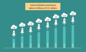
There are more than 24 million eCommerce websites, and the number is increasing with time. These platforms are counted as an adequate sales channel and have a global market worth $3.53 trillion.
Source
But in this much-concentrated market, how a platform will generate sales?
Many factors influence the clients’ purchase decision; among them, the most significant is the website.
Around 65.23% of consumers abandon their shopping due to inadequate website features. Let’s discuss some of the website features that create an effect on increasing sales.
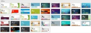
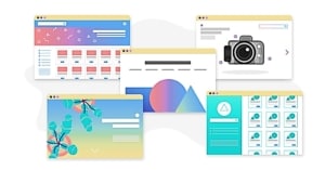
1. Simple Website Interface
The too much busy and overloaded look of the website may create a negative impact on sales. See the following illustration, which depicts the crowded website interface.

Around 48% of the people create their perception just by looking at the website, which directly affects brand reputation and sales.
The usage of decent color combination and elegant typography will create an attractive interface. Simpler websites will take less time to load than average websites and diminishes any potential chances of bounce rate.
Experienced web designers should be able to advise you on how to come up with a simple, user-friendly interface.
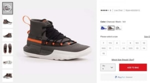
2. Product Image Quality
One picture is better than thousand words, may sound cliché to many of you, but it is true. Unlike the brick and mortar store, customers are completely dependent upon images while shopping from the eCommerce platform.
Do you trust a brand that is unable to take a clear picture of its products? I guess no, around 33.16% prefer to see more than one image of the brand.
Along with pictures from multiple angles, you can also include a 360-degree shot. A shot is in which users can rotate the image and observe the product from different angles. If you can add a few lifestyles or in-context images that will support consumers in imagining the usage of the product.
Source
3. Navigation Convenience
The common mistake that eCommerce platforms are doing is to ignore navigation. They spend a huge amount of money on generating traffic to their webpage. But they do not have easy navigation on the webpage that abandon the sales.
Around 94% of the consumers believe that easy navigation is the must-have feature on the webpage. Here are some tips that you can follow for creating adequate navigation;
- The main navigation menu shall be visible and have a common design for easy identification.
- Organize products into categories and then sub-categories for convenient product searching.
- There should be a search bar at the top of every page to directly navigate customers to the desired page.
4. Adequate product Description
The product description is the most demanded feature on the eCommerce platform. 76% of the consumer’s purchase is dependent upon product description. Provide useful and relevant information regarding the product.
This should cover the basic benefits and features of the product. Make sure to provide details regarding how your product is suitable for usage.

Source
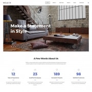
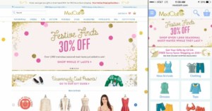
5. Mobile Friendly
79% of the consumers access eCommerce platform through their smartphone. This creates an obligation for your website to be mobile-friendly. The responsive design of the platform will create a more user-friendly experience.
Make sure that all the important functions and checkout options are provided in the mobile interface. The website loading time should be minimized in the mobile interface. The convenience and user-friendly options will trigger consumers to make more frequent sales contrary to the web.
See the following image, which compares the web and mobile page of a similar platform.
6. Easy Checkout
It is the most crucial and core element of the eCommerce platform. If it is not adequate and simple, then none of the above-mentioned features will be useful.
18% of the users abandon their sales during checkout due to the following reasons;
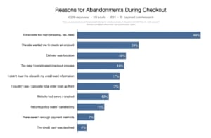
Source
For the convenient checkout process, split the process into different steps. Save the payment options and credit card details. Please do not ask for too many information as it may offend the user.
7. Rating and Reviews
Reviews and rating of the product on your platform is directly effective on sales and purchase decision. Around 57% of consumers read reviews before purchasing a product.
The platform is liable to provide adequate reviews from customers; either they are negative or positive. The positive reviews can create word of mouth and increase the sales of the product.
But what if the reviews are negative? It is still the platform responsibility to post negative reviews. This is because too many positive reviews may sound fake; as one shoe can fit all, one product can satisfy every consumer.
See the following Apple air pods review on Amazon.

8. Product Collection
Another important feature of an eCommerce platform is product collection. The collection or bundle up of the products in one place is known as a product collection. The visibility of the product and the presence of similar product together will increase the potential of sales.
It adds to the convenience and navigation of the products. The assemblage can also be used as an on-page SEO to optimize the platform ranking.
For providing a touch of personalization, you can include a recommended product list with other products. The last custom search option is also a relevant option to retain consumers.

9. Filters
Almost all of the eCommerce market leaders have price range filters on their website. The experts’ emphasis having price filters as an essential element. Like the report writing service is essential for a successful academic career. Despite its significance, only 16% of the top-ranking website provides this feature.
Along with it, there must be other filters also that sustain the customer journey. The filtering option will provide rapid browsing options. It can also optimize SEO ranking and increase the wider range of products more conveniently.
All of these are directly affected by customer satisfaction, SEO ranking ultimately affecting sales.
10. Visible Call to Action
According to Student Essay UK, the call to action button is the heart of the website. But, 70% of websites do not have this button on their homepage.
For creating an adequate call to action button, see the following tips;
- Create a more logical and creative button.
- Leave white space around the button to increase its visibility.
- Use first-person verbs and reflective pronouns.
- The color and shape of the button must be attractive.

Summing it up
The competition in the eCommerce market is increasing rapidly. There is a huge number of websites joining the league on a daily basis. In these conditions making a distinct position of your eCommerce platform is a challenge.
The website can be the main factor that can create difference among competitors. There is a number of website features that can be revised for gaining consumer’s attraction. But gaining attention is not the only purpose; generating sales is the main purpose.
For this, there are specific features that can create a direct and significant impact on the sales of a platform. All of these factors are mentioned above. I hope that these features will be supportive of you in increasing the sales of your platform.
Author’s Bio
Melissa Calvert is currently working as a devoted SEO Expert at Crowd Writer and Master Thesis, the organization famous for its do my coursework UK. She is a dedicated SEO expert and has served in reputable organizations. Her passion for writing is visible in her blogs.