
Why You Should Aim To Become A Graphic Designer?

There are many people around the world passionate about designing. They create things from their imagination, not because they can but because they love to do it.
The perks of being a graphic designer are not just limited to doing work from the comfort of your home. It enables you to put something out in the world that was not already a part of it. It helps you channel your creativity towards a better target and make a profit out of it.
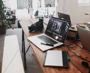
Technology across the globe is constantly changing for the better. The tools and accessories that are accessible now were not imagined a few years earlier. This has made the work of a graphic designer more easy, exciting, and engaging.
The life of a designer is not easy, however it is filled with many things that make it enjoyable. This work has intrigued many in pursuing graphic designing full time, and in doing so, many have fulfilled their life-long dreams. Some people can make their mark in individually climbing steps, but some require professional advice. Whatever your case, premium graphic designing services in Canada or around the world offer platforms for young enthusiasts to pursue their passion. They also provide services for organizations in case you want to be an entrepreneur.
If you have currently hit the career choosing phase and are passionate about designs, this blog will help you in explaining the advantages of choosing graphic designing as your full or part-time career. From working as per your schedule to spreading your network across multiple organizations, the freedom of work is immense for a graphic designer. Narrowing down the list, the following are the three main advantages of being a full-time graphic designer.
1. A Flag With Your Name
Whether you are skilled in creating small logos or more prominent product banners, every design has the potential of being a revolutionary thing of change. Whatever you make will have your mark on it, and some extraordinary marks are followed back to find the creator. If you have eyes for creativity and can understand detailing, you might like to work as a designer.
2. Multiple Opportunities
The choice of platforms of work for graphic designers is spread all over the world. Many organizations offer job opportunities, but freelancing may attract you more if you really want to enjoy life. Multiple choices like videography, photo illustrations, UI/UX designing, motion graphics, production, or web designing are available for a person to choose from. Many new and old graphic designing services agencies have also modernized and are flexible with their work, yet remaining creative and attractive. Whatever your choice, the possibilities are always available to choose for your next job or starting anew.
3. It’s Fun To Play With Creativity
The main advantage of being a graphic designer is playing with imagination. If you have mastery of brushes and tools, then you can give your ideas a visual appearance. With multiple changes over the years, designer jobs and work has become more exciting and engaging. Whether you are a team person or a one-man army, there is always a place for every individual.
When choosing a distinctive path for a career, many people get confused with multiple choices. By being a graphic designer, you do not have to limit yourself in one way; whenever the work gets hectic, the possibility of neighboring branches is always open. The choices are many; What is Yours?!
References:
https://outorigin.com/services/graphic-designing/
Keywords:
Graphic Designing
Graphic Designer In Canada


