
Accessibility in Web Design: How to Build Inclusive Websites That Everyone Can Use
A good website should not only look impressive. It should also be easy for people to understand, navigate, read, and use. That sounds simple, but many websites still create barriers for visitors without meaning to.
Some users may have low vision. Some may rely on screen readers. Some may use only a keyboard. Others may be older, temporarily injured, using a mobile phone outdoors, dealing with a slow connection, or simply trying to complete a task quickly while distracted.
That is why accessibility in web design matters. It is not just about meeting technical guidelines or avoiding legal problems. It is about creating websites that work better for real people in real situations.
When accessibility is treated as part of the design process from the beginning, the result is usually a clearer, faster, more usable website for everyone.
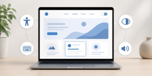
Accessibility Is About Real Users
Many people think accessibility only applies to a small group of users with permanent disabilities. In reality, accessible design helps a much wider audience.
For example, captions help people who are deaf or hard of hearing, but they also help someone watching a video in a noisy place. High contrast helps users with low vision, but it also helps anyone reading a screen in bright sunlight. Clear form labels help people using assistive technology, but they also reduce confusion for every visitor.
Accessible design is really about removing friction. It asks a simple question: can different people use this website comfortably, regardless of their device, ability, environment, or level of technical confidence?
That mindset leads to better design decisions.
Start With Clear Structure
One of the most important parts of accessibility is structure. A website should be organized in a way that makes sense visually and technically.
Headings should follow a logical order. The main title should be clear. Sections should be grouped properly. Menus should be easy to understand. Buttons and links should describe what they do.
This helps all visitors scan the page, but it is especially important for people using screen readers. A screen reader can help users jump between headings, links, and sections, but only if the page is structured correctly.
For example, a service page should not jump randomly from a main heading to small decorative headings and then back to another major section without order. A blog post should not use headings only because they look good visually. Headings should describe the content below them.
Good structure makes the website easier to understand, easier to navigate, and easier for search engines to interpret as well.
Use Readable Text and Strong Contrast
Text is one of the most important parts of any website. If people cannot read the content comfortably, the design has failed, no matter how attractive the layout looks.
Readable typography includes font size, line spacing, paragraph length, color contrast, and spacing between sections. Small gray text on a white background may look elegant in a mockup, but it can be difficult to read for many users. Thin fonts may look stylish but can create problems on mobile screens.
Strong contrast between text and background is especially important. Visitors should not have to strain to read basic information. Buttons should also stand out clearly from the surrounding design.
Accessibility does not mean every website must look plain. It simply means visual choices should support usability. A brand can still have personality, color, and style while remaining readable.
Make Navigation Simple
Navigation is one of the first places where accessibility problems appear. If a visitor cannot find what they need, the website becomes frustrating.
Menus should be clear, predictable, and easy to use. Too many menu items can overwhelm users. Vague labels such as “Solutions” or “Resources” may work in some cases, but they should be used carefully. If visitors cannot tell what a menu item means, they may not click it.
Accessible navigation should also work with a keyboard. Some users cannot use a mouse and instead move through the page using the Tab key. If a menu, dropdown, form, or button cannot be reached by keyboard, that creates a serious barrier.
A visible focus state is also important. When a user tabs through a page, they should be able to see where they are. Removing focus outlines just because they look unattractive is a common design mistake.
Design Forms With Care
Forms are often where users take important actions. They contact a business, request a quote, subscribe, register, book an appointment, or make a purchase. If forms are difficult to use, the website may lose enquiries and conversions.
Accessible forms should have clear labels, helpful instructions, and useful error messages. A placeholder inside a field is not enough because it can disappear once the user starts typing. Labels should remain visible or clearly associated with each field.
Error messages should explain what went wrong and how to fix it. For example, “Invalid input” is not very helpful. “Please enter your phone number using only numbers” is much better.
Forms should also avoid asking for unnecessary information. Long forms can discourage users, especially on mobile devices. The easier the form is to complete, the more likely people are to use it.
Write Link Text That Makes Sense
Links should be descriptive. A visitor should understand where a link will take them without needing to read the entire surrounding paragraph.
Generic link text such as “click here” or “read more” is not ideal, especially when repeated many times on the same page. It gives very little context to people using screen readers or scanning quickly.
Better link text describes the destination. For example, “view our pricing plans,” “download the accessibility checklist,” or “read our website redesign guide” is more useful than “click here.”
This small habit improves accessibility, usability, and content clarity at the same time.
Think Beyond Visual Design
Many accessibility issues happen when a website is designed only for how it looks on a large desktop screen. But users interact with websites in many different ways.
Some visitors zoom in. Some use voice commands. Some use screen readers. Some browse from a phone. Some have color blindness. Some are not fluent in the language. Some have cognitive challenges that make complex layouts harder to follow.
This is why businesses get better long-term results from websites designed around real user needs rather than designs that only look polished in a presentation. A website should be planned around clarity, comfort, and practical user journeys.
When design decisions are made with real users in mind, accessibility becomes a natural part of the process rather than a last-minute fix.
Use Images Responsibly
Images can make a website more engaging, but they should not create barriers.
Important images should include alternative text that explains their purpose. This helps users who cannot see the image understand what it communicates. However, decorative images do not need long descriptions. The goal is not to describe every pixel, but to provide useful context.
For example, if an image shows a company’s team, the alt text might say, “Team members at the company office.” If an image is purely decorative, it can be handled in a way that screen readers skip it.
Avoid placing important text inside images whenever possible. If the text is part of the image, it may not be readable by assistive technology, and it may scale poorly on mobile devices.
Make Video and Audio Content Accessible
If a website uses video or audio, accessibility should be considered there too.
Videos should include captions when speech is important. Captions help people who are deaf or hard of hearing, but they also help users who cannot listen with sound. If the video contains important visual information, a transcript or written summary can also be useful.
Audio content should include transcripts where possible. This helps people who cannot hear the audio, but it also helps users who prefer reading or want to quickly find a specific point.
Media should also avoid autoplaying with sound. Unexpected audio can be disruptive and confusing, especially for screen reader users.
Keep Motion Under Control
Animations can make a website feel modern, but too much motion can harm accessibility and usability.
Some users experience discomfort from excessive movement. Others may find animations distracting. Large animated sections, fast-moving sliders, parallax effects, and auto-playing carousels can make it harder to focus on the content.
Motion should have a purpose. It can guide attention, show progress, or make an interaction feel smoother. But if an animation only exists to impress, it may not be worth the cost.
A good accessibility practice is to respect users who prefer reduced motion. Websites can be designed to limit animations for people who have selected that setting on their device.
Accessibility Supports Better Mobile UX
Mobile accessibility is especially important because small screens already create limitations. Text, buttons, menus, and forms need to be easy to use with one hand, on different screen sizes, and sometimes in imperfect conditions.
Buttons should be large enough to tap. Links should not be placed too close together. Text should be readable without zooming. Menus should not be confusing. Popups should not cover the entire screen or become impossible to close.
A mobile-friendly website is not automatically accessible, but good mobile UX and accessibility often support each other. Both are about making the experience easier for the user.
Test With Real People and Real Tools
Accessibility should not be based only on assumptions. Testing is important.
Automated tools can help identify issues such as missing alt text, low contrast, heading problems, or form label errors. However, automated testing cannot catch everything. A website may technically pass some checks and still feel confusing to real users.
Manual testing is also valuable. Try navigating the website using only a keyboard. Increase text size and see if the layout still works. Check pages on a phone. Ask someone unfamiliar with the website to complete a basic task.
The goal is not perfection on the first attempt. The goal is progress and awareness.
Accessibility Can Decline Over Time
A website may launch with good accessibility, but that does not mean it will stay that way forever.
New pages may be added without proper headings. Images may be uploaded without alt text. Plugins may change form behavior. Theme updates may affect contrast or layout. New popups, sliders, or third-party tools may create usability problems.
This is especially true for WordPress websites, where content, plugins, themes, and settings often change over time. Accessibility should be part of ongoing website care, not just the initial design project.
Having ongoing care that keeps WordPress websites usable and reliable can help website owners catch problems before they become bigger issues. Regular updates, backups, testing, and maintenance all support a healthier user experience.
Accessibility Is Good Business
Inclusive websites are not just better for users. They are better for business.
An accessible website can reach more people, reduce frustration, improve trust, support SEO, increase conversions, and create a more professional brand experience. It also shows that the business cares about how people interact with its digital presence.
Many accessibility improvements are not complicated. Clear text, strong contrast, simple navigation, descriptive links, proper headings, usable forms, and mobile-friendly layouts can make a big difference.
The most important step is to stop thinking of accessibility as an extra feature. It should be part of good web design from the beginning.
Final Thoughts
Accessibility in web design is about building websites that more people can use with confidence. It is about clarity, structure, readability, navigation, performance, and thoughtful interaction.
A truly inclusive website does not make visitors struggle to understand content or complete simple tasks. It removes unnecessary barriers and gives users a smoother path to the information or action they need.
In the end, accessible design is not separate from good design. It is good design. It helps businesses serve more users, communicate more clearly, and create better digital experiences for everyone.
Leave a Reply
Want to join the discussion?Feel free to contribute!