
55+ Awesome HTML5 Mobile Templates Free & Premium
Are you looking for html5 mobile templates? Today we are going to show you some of the best quality & amazingly designed free & premium mobile website templates. These templates can be used for business, portfolio, personal profile, presenting contents, app presentation & any kind of mobile app websites.
There are lots of awesome designed website templates available on the web. Most of the designers are integrating responsive technology into their templates even free templates also have responsive feature like our templates. You can see our free WordPress themes & bootstrap html templates.
We released some fantastic premium quality but free templates & wp themes for our users. All of our themes are 100% responsive. Anyway, why designers are integrating this feature? & why you must need to use responsive website templates? If you are already a designer then you may know this but if not then let me tell you about this feature. Over 60% internet users are using smartphones & tablets.
So it’s important to present your site nicely in any kind of devices including desktop, laptop, smartphones, iPhones, iPads, Tabs, Tablets etc. Otherwise you will lose a big amount of users or customers. You may want to know what exactly responsive feature does.
Well if you have this feature into your website then your site will be automatically adapt in any kind of devices like we told above. You no need to create website app or mobile version for your website.
The most popular responsive front-end framework is twitter bootstrap. Most of the web designers are building their project with it. Why? Because bootstrap allows designers to create beautiful & professional mobile website designs we mean responsive templates.
Designers can easily & quickly create responsive website templates through bootstrap framework & this framework is getting more popularity day by day. Bootstrap is especially well known for its responsive technology. We hope you got some knowledge about responsive templates.
But some users need their website only for mobile devices not desktop or laptop. They might want to target only those users who are coming from small devices. If you are among of them & looking for a html5 mobile template for your next project for promoting your mobile app or any other related to mobile devices then you are in the right place.
Here you are going to see some fantastically designed mobile web templates which are especially designed for small devices. We have collected both type of template free & premium. You may not find all of the features that you are looking for but free mobile templates are still quite good to start with.
We recommend you to purchase a premium one from mobile web templates below. Why? Because those have almost all those features that you might need like Device detection scripts, premium image gallery plugins, premium sliders, complete touch & swipe supported, modern navigation, smooth effects, page loading effects, multiple color schemes, multiple page templates, multiple website themes, left/right/both side nav panels, premium icon sets, beautiful typography & much much more.
Hope this collection will help you to find a perfect html mobile template for your next project. If you feel this collection can help others then don’t forget to share this post in social media. Thanks
Free Mobile Templates
Perfect Fitness – Free flat sports mobile html template

Social Summer – Mobile and Tablet Free Template

Hexa – Free Responsive Mobile Website Template

Doctor – Single page Free Mobile Website Template

Ero – Free Mobile Website Responsive Template

Bizname – Multipurpose Free Mobile Website Template

Cyan – Free Personal Use Mobile Website Template

Ruddy – Corporate Free Mobile Website Template

Lazyday – Personal Portfolio Free Mobile Website Template

Premium Mobile Templates
HTML5 Mobile Templates
After joining ONE Subscription, you are going to get access to an extensive set of ready-made solutions. Without a doubt, there are many HTML templates. Among them, you can find high-quality choices designed for the most popular niches.

As an example, these include business, fashion, photography, food, society, sports, and many others. Each template has a particular selection of tools based on the topic. Yet, each of the packages provides a large number of options to enhance your online-project. As an example, they have a mobile-first design that people can view on different devices. In addition to this, one gets a chance to customize his or her website in a drag-and-drop way.
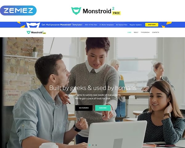
Monstroid2
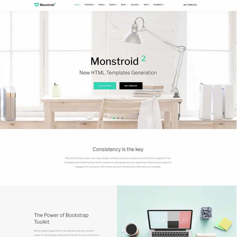
Key Features: blog and portfolio templates, complex social integration, contact and booking forms, advanced video background, slider.
Farm
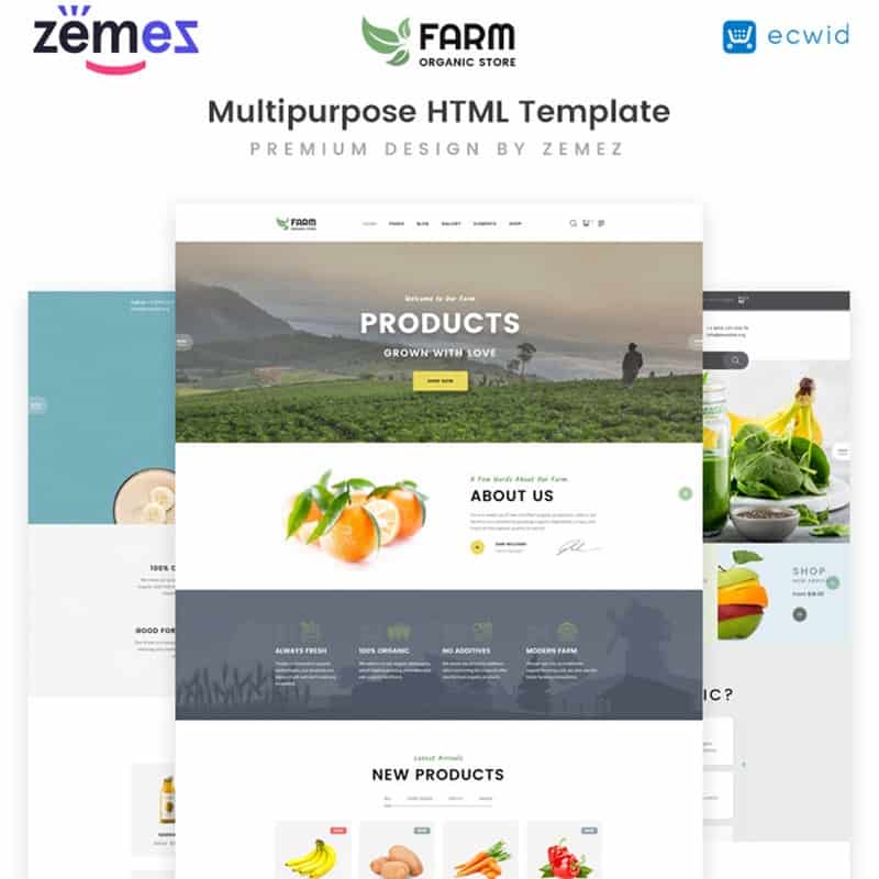
Key Features: cross-browser compatible design, multiple gallery types, 35+ pre-made pages, newsletter subscription, contact form.
Taxer

Key Features: multiple gallery layouts, blog functionality, fully-responsive design, live search, newsletter subscription.
Real Estate
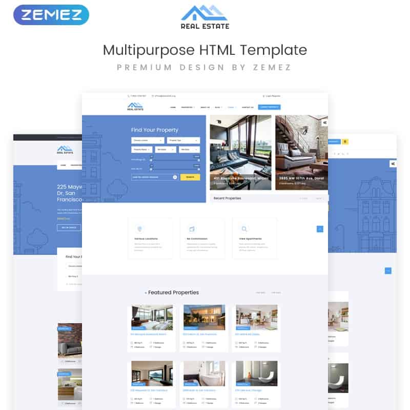
Key Features: 30+ pre-designed pages, Parallax effect, contact form, drop-down menu, Google Maps.
Top Project
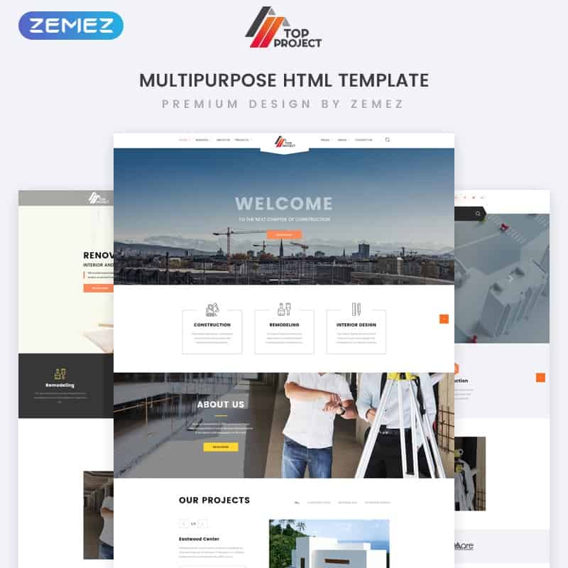
Key Features: various animation effects, blog functionality, gallery, Google Fonts, newsletter subscription.
Civil Group
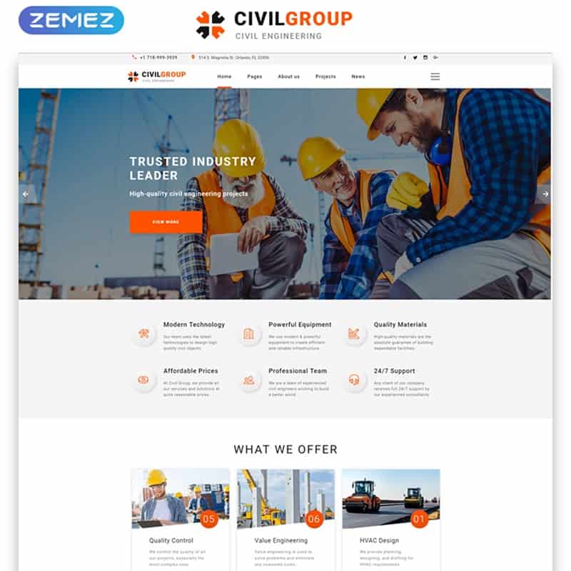
Key Features: various animation effects, blog functionality, gallery, Google Fonts, newsletter subscription.
Steel and Fabrication
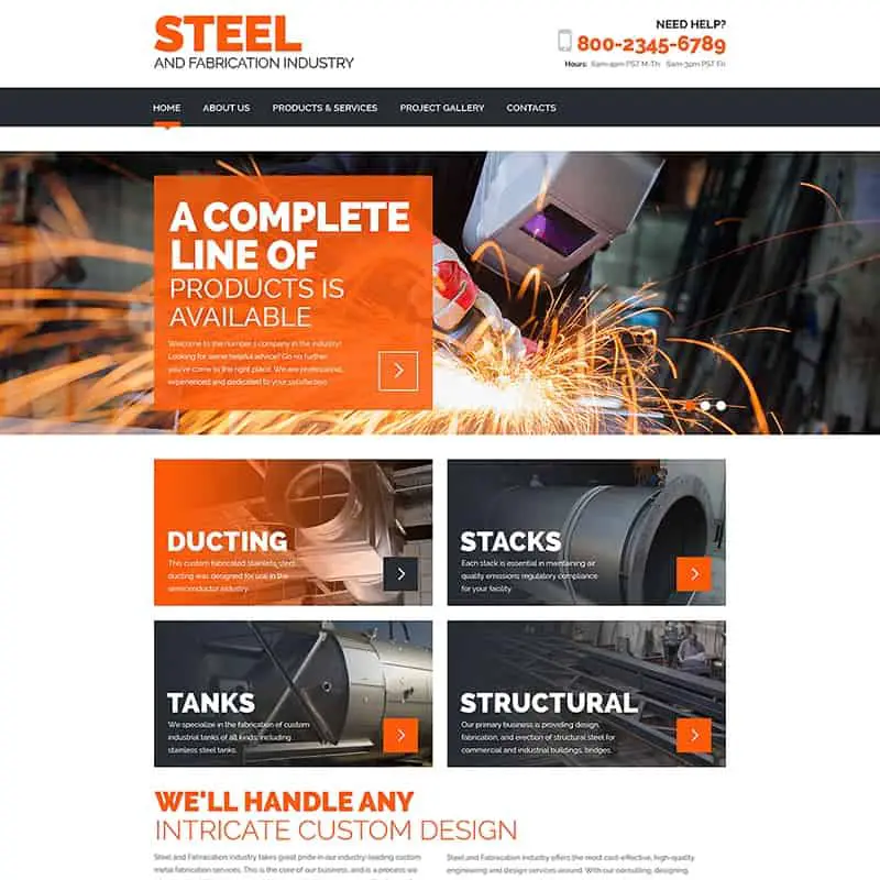
Key Features: Google Maps, contact, drop-down menu, several gallery layouts, cross-browser compatible design.
Brave
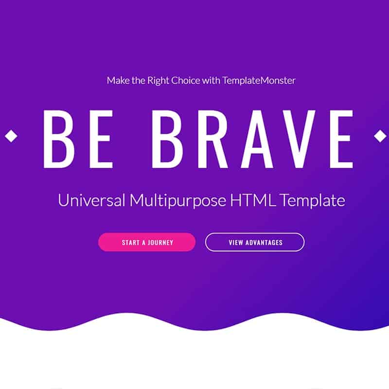
Key Features: Parallax effect, background video, blog templates, several footer styles, booking form.
All Stars
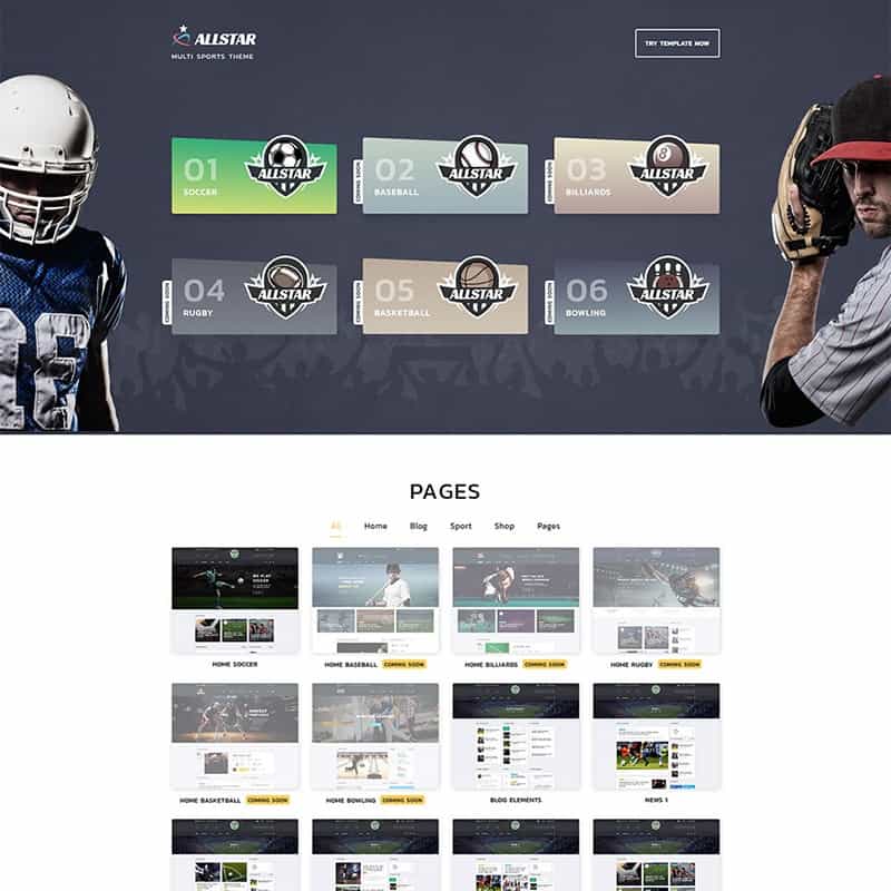
This impressive HTML template is a perfect choice for those who need to present different sports-related topics. It has six additional ready-to-use templates designed for the most popular sports. The package also gives a chance to work with several blog layouts and eCommerce pages. To make it easier for people to get familiar with the compelling content, you can add a live search. It will improve their user-experience and arouse more interest.
Visage
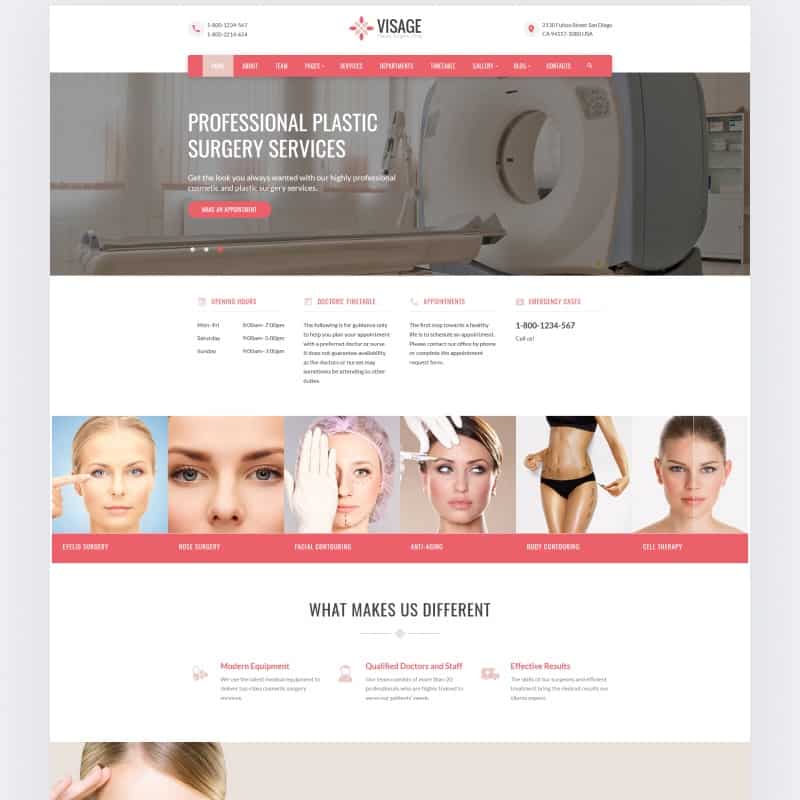
Key Features: five blog layouts, multiple gallery types, contact form, newsletter subscription, Google Fonts.
Cute

Key Features: gallery, pricing list, services and testimonials, projects, contact form.
Flex
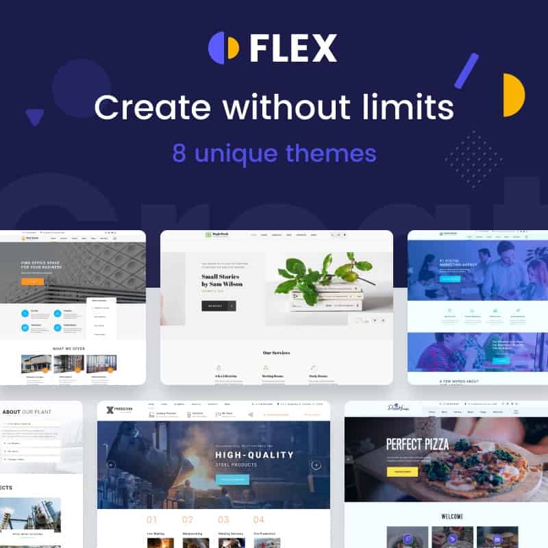
Key Features: live search, newsletter subscription, contact form, drop-down menu, Google Maps.
DreamSoft
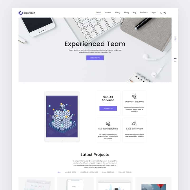
Key Features: different gallery types, newsletter subscription, drop-down menu, Google Fonts, live search.
Dynamics
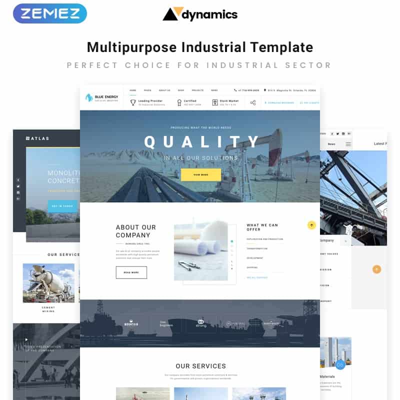
Key Features: Google Fonts, gallery, fully-responsive design, newsletter subscription, contact form.
Alice
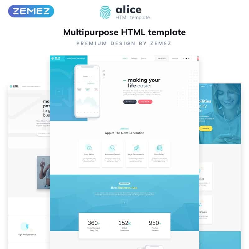
Key Features: several gallery types, fully-responsive design, bonus images, highly-customizable nature, online-store support.
ProMobile

ProMobile is amazingly designed html5 template that comes with 50+ pages. It has integrated off-canvas smart navigation menu for giving your users a better experience. ProMobile not only supports in small devices also supports various tablet sizes. Touch & swipe enabled multiple sliders included for showcasing various types of contents. You can choose a template style from 3 different portfolio layouts. Multiple color schemes available to make this template your very own.
A great feature was integrated into ProMobile & that is you can display particular contents for any specific screen sizes. All the major social platforms included perfectly for getting social exposes. Lots of other features available such as scrollable menu, testimonial, ajax & php powered contact form, login page & many more.
Preview Read More
Biotic

Biotic is another mobile template that designed with advance Ajax functionality. It comes with 3 different color schemes such as yellow, blue & green. It’s fully touch & swipe enabled. Every page opened through ajax so no page loading. It has beautiful & modern off-canvas icon menu. A fantastic gallery script integrated for showcasing images beautifully. Some other features are: 3D page transition effects, toggle elements, tabbed content, working contact form & many more.
Preview Read More
Circle

Circle is another awesome mobile website template which lets you create a modern & professional website for small devices. You can choose your homepage from 5 different layouts such as circular image slider, fullscreen slider, classic slider, fixed footer & thumbnail landing page. Circle also comes with 5 navigation menu style that will definitely give you more flexibility.
It can automatically fit on any kind of devices including tablets. In total 30+ responsive html5 pages included with 100+ most useful content elements that you can use by just copy & paste. Some other features: multiple sliders, multiple color schemes, beautiful typography, calendar, multiple portfolio pages, device detection, social buttons & lots more.
Preview Read More
Washington

With amazing loading effects Washington came up. It looks clean, elegant & professional, can adapt automatically on every kind of devices. This template offers ready to use elements such as input fields, toggles, styled button, slider widget, social buttons, map, check boxes & many more. Most of the element implemented with modern touch. For advance typography Washington includes 500+ Google & 730+ other free fonts. It supports android, iPhones & as well as all other smartphones.
Preview Read More
Mobix

For your mobile website Mobix can be your right choice. It has six different color scheme integrated. So you can easily choose whatever color suits you best from those. It’s flexible & well-structured layouts let you change or edit anything you want. Mobix includes beautiful 3D effects that can increase your user’s experience. All the useful content elements implemented such as toggles, tabs, slider, photo gallery, login & many more. It designed using html5 css3 & ajax.
Preview Read More
Tinybar

Its name is TinyBar but actually it’s not a tiny product. It has huge features that will help you to develop your mobile site with ease. TinyBar perfectly designed for small devices which means that your website will look great on any kind of screen sizes. You are going to get 32+ awesome layouts with 100+ web elements. Its elegant typography definitely can increase user readability.
If you have lots of portfolios for showing-up then don’t worry. You will get 3 different layouts for showcasing your artworks. Device detection technology included so you can specify which content should display in which devices. Other features like team members, speech bubbles, timeline style page, ajax/php contact form, video embed, social buttons & lots more.
Preview Read More
Darkley

Darkley designed with all those features that you must need while going to build your web app or mobile site. It includes beautiful page transition effects, 6 color combination, 12 html5 templates & many more. The contact form is fully dynamic which means that your users can communicate with you directly from your website. Darkley is HiDPI ready which ensures compatibility for IOS devices.
Preview Read More
Vizito

It’s a perfect template if you are looking for a mobile site template for showcasing your portfolios. It designed especially for that. Multiple column grid implemented with pagination for the portfolio, so you can easily choose one of them for displaying your works. Vizito supports high regulation which is very important especially for IOS devices. 12 html page are pre-packed with 6 color schemes into Vizito mobile template.
Preview Read More
Runio

Runio designed with liquid structure which means that your site can be adapted on any kind of screen sizes. 13 page layouts are available with tons of ready to use web elements. Dynamic contact form included. Runio uses css3 & html5 technologies. Lots of icon sets implemented with light & dark version.
Preview Read More
Flaty

Flaty comes with huge rich full features. For displaying your creative photos Flaty includes a touch & swipe enable gallery with colorbox integration which means your images will opened up modal windows with smooth animations. Over 800+ icons integrated which you can use to present your contents in eye-caching way. Most usable content elements you will find in this mobile layout such as recent widget, multiple columns for texts & images, ads widgets, comment section & lots more.
Preview Read More
Around – Mobile & Tablet Responsive Template

Around is a touch & swipe enabled tablet & mobile website template which can be used for multipurpose. In the home page you will find a fullscreen slider which is also touch friendly. Scroll modal overlay menu made this theme more user friendly. Around used font-awesome & google fonts for typography. You will be able to add more features by just copy & paste from 100 pre-made elements.
It has portfolio section where you can display your portfolio works nicely. A login & register page also available. Not only that, Around has devices detector functionality, so you can display any specific content for a particular device. You will find beautiful social share functionalities into Around mobile template.
Key Features: 17 html pages, Testimonial slider, PhoneGap ready, Touch & Swipe enabled, multiple color schemes, elegant & beautiful typography, three portfolio styles, calendar, error/login/signup/coming soon pages, device detection, popup social share, share buttons, video embed, Scrollable menu, ajax powerful php contact form & lots more.
minio – Responsive HTML Mobile Template

Minio is creatively & beautifully designed for mobile web app, mobile website & native mobile app. It comes with unlimited design possibilities. Minio has left & right both type of nav panel option, so you can set it up which one suits you. The designer integrated some cool features like photos & video pages, login & social share panel, useful web ingredients like tab, toggle, tabs, forms, slide blocks & much more.
Key Features: Unlimited design possibilities, left/right nav panel, perfectly adapt in any devices, web app ready, easy to add or edit contents, lots of useful elements etc.
Slidebox – Modern Mobile & Tablet Responsive Template

Slidebox designed with user friendly in mind. It will enhance browsing experience for sure. Slidebox has nice left & right nav option panel. Your users just need to swipe left to right for opening the nav panel. Also you will be able to set dual nav panel if you wish. In any kind of devices this mobile design template will look just perfect & amazing.
It has high regulation especially for iPhone, iPad or any other apple devices. SlideBox comes with 27+ html pages including 100+ ready-made copy paste features, uses font-awesome & google fonts for beautiful typography, completely touch & swipe enabled, device detector which will allow you to display any specific content in a chosen device. It has working ajax/php contact form & app style message bubbles.
Key Features: Touch & swipe enabled, left/right/both navigation panel, smooth effects, font-awesome, google fonts, 27 page template, 100 ready-made copy paste features, multiple color schemes, calendar, 404/error/login/signup/coming soon pages, social share buttons & lots more.
Below – Exclusive Responsive Mobile & Tablet Template

Below is a material design html5 mobile template which is packed with 20 html pages. It builds with some beautiful & useful web elements like css3 toggles, buttons, portfolio sections, unique css3 animations, tabs & lots more. The designer of this template integrated swipe image slider & photoswipe slider which is made this template more awesome.
It’s a complete touch & swipe enabled mobile html5 template which can be used for multipurpose.
Key Features: Modal according menu, touch swipe enabled, useful css3 elements like tabs, toggle, buttons etc, 2 different sliders, css3 portfolio section, jquery checkbox, 100% mobile & tablet ready & much more.
Blinds – Flexible Mobile HTML/CSS Portfolio Template

Blinds is a perfect mobile site template especially designed for portfolio websites. Its super supported in any kind of high regulation devices. It has no fix layout for specific device it means this mobile template will adapt automatically in any devices including iPhones, iPads, Android phones, window phones tablets etc.
Key Features: 12 page templates, 6 different color schemes, working ajax contact form, HiDp ready, 48 menu icons, Liquid structure, mobile detection redirect script & much more.
Mom – Elegant Mobile & Tablet Responsive Website Template

Mom is elegantly designed flat material design html5 mobile template. By using this template you will be able to create an amazing website in any purpose. It builds especially for mobile & tablet devices like android phones, window phones, iPhone, iPad etc. Two different touch enable sliders were integrated to make this mobile website design which area Swipe image slider & Photoswipe slider.
Not only that, Mom has very useful css3 elements like buttons, toggles, tabs, animations & much more. You will be able to setup left or right or both navigation panels.
Key Features: Flat & material design, touch & swipe support, 2 different image slider, portfolio section, css3 animations, css3 elements, font-awesome icons, IOS homescreen web app & lots more.
Landor – Responsive Mobile & Tablet Website Template

Landor is a simple way to show off your products on small screens without compromising your desktop & at the same time, giving the user an amazingly, unintrusive, immersisve experience right at the top of the fingers. Landor aims to make your mobile device a selling point based simply on based simply on giving your content what it deserves quality.
Key Features: useful css3 elements like buttons, toggles, tabs, animations, portfolio section, font-awesome, swipe image slider, photoswipe slider, jquery checkbox, mobile & tablet ready & lots more.
Nightly – A Bold jQuery mobile html5 template

Nightly is a fantastically designed mobile web template which is comes with 20 html pages. It has most of the features that a mobile website design need. Nightly integrated swipe & touch supported Owlslider. It’s a PhoneGap ready template. It also has device detection script integrated which through you will be able to display specific content for a particular device.
Key Features: Owl Carousel, 2 different themes, iScroll, pricing table, php contact form, 20 html files, device detection & much more.
Vibrant – A super-sharp template for touch Mobile devices

Vibrant is a minimalistic style mobile template. It builds with touch supported slider on home page. Vibrant comes with unique & modern navigation menu style.
Slasher – unique Mobile & Tablet Responsive Template

Slasher is a full page html5 mobile template, highlights a perfect color schemes, a simple & institutive full screen navigation that makes you page feel alive. The dotted background allows your users to see a highlighted sneak peak of products you build while at the same time having the navigation right at their finger tips.
Expan – Best Mobile Design Template

Expan is a mobile portfolio template which was build especially for small devices. It will adapt perfectly in any kind of devices. It comes with 12 html pages, 6 different color schemes, ajax contact form & lots more.
Ciuter – Responsive Mobile & Tablet Website Template
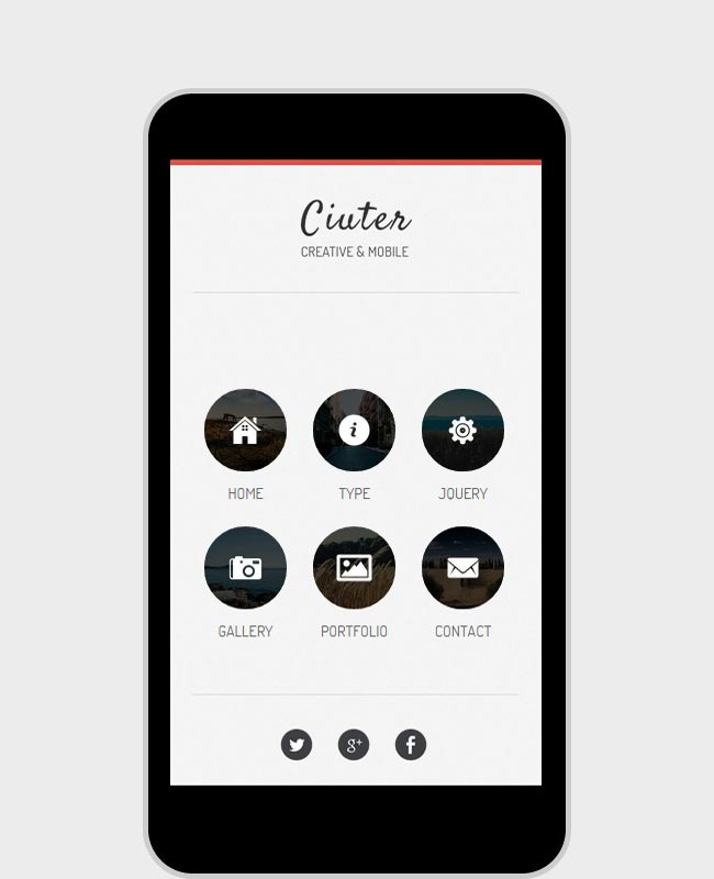
Ciuter is perfect portfolio mobile app template for showing your portfolio items with popup image view. It also has touch enable image gallery slider on home page where you can display your main featured pictures. Ciuter used font-awesome icons & google fonts for creating beautiful typography. It comes with also some fantastic css3 web elements like tabs, toggle, buttons, animations, jquery cheekbox & lots more.
Pocket – Multi layout Mobile Website Template

Pocket is the ultimate solution for any kind of mobile websites. It can be used for multipurpose, comes with 10 different themes which area restaurant, boutique, car service, barber shop, lawyer, medicine, construction, technology, blog & business cons. Pocket build with html5 & css3, also integrated 300+ retina icons for making this template more awesome & professional.
The user friendly top menu let your users browse your pages smoothly. Through the beautiful fullscreen slider you can showcase your featured product screenshots. Lots of useful features are available also to setup easily in this template.
Smarty – Perfect mobile html5 template

Smarty is designed especially for business mobile websites. It’s a complete mobile site solution because Smarty has 20 different types of website themes. Also comes with 30+ html pages & included premium layer slider worth $10 & live twitter plugin worth $4. Smarty has unique video, photo galleries & blog section. You can build any kind of business mobile site with smarty.
Key Features: 20+ website themes, 30+ html pages, layer slider, live twitter plugin, 500+ awesome fonts, working contact forms, retina ready, left/right nav panels & much more.
Mobilize – Touch Optimized Mobile Template For easy Mobile solution

Key Features: responsive mobile & tab layouts, Touch enabled slider with 24 different effects, mobile swipe supported portfolio section, contact form with validation, twitter feed, 60+ high regulation icons, multipage transitions, 20+ html pages, event style list, 9 different page transition effects & lots more.
Go Mobile – Multipage html5 mobile template

This is a fantastically designed multipage with multi skin template which is especially made for mobile website. It comes with 12 different skins, multiple navigation menus, multiple page elements, home screen app & much more.
Slideout – Exclusive Responsive Mobile & Tablet Website Template

Key Features: jQuery swipe image slider, jquery photoswipe slider, jquery checkbox, css3 useful elements, css3 animations, font-awesome, homescreen web app & lots more.
Boxed – Clean Elegant Tablet & Mobile Website Template

Boxed is a flat & material design mobile web template which through you will be able to showcase your contents in a modern way. This template will adapt perfectly in any kind of devices.
Glovebox – Responsive Multi layout Mobile & Tablet Template

Glovebox is amazingly created html mobile template which is comes with awesome 3d style navigation menu. It will make your website looking more modern to user yours. The designer integrated 2 different touch & swipe enabled image slider which through you will be able to display your photos beautifully.
Oceam – Clean mobile app template

Oceam is a html5 template for mobile websites. It has beautiful css3 animation which can attract your visitors easily it means you will get more pageviews. This template also has elegant thumb print size full screen navigation. Oceam build with amazing css3 unique animations, css3 elements, swipe supported image sliders, 2 different color schemes & lots more.
Profiler – Personal Mobile & Tablet Responsive Template

If you are looking for a tablet & mobile website template for presenting yourself I mean your profile then Profiler template will be the perfect choice for you. You will be able to showcase yourself fantastically & in a modern way by using Profiler template. It has 2 different color schemes to choose from, has 2 different touch supported image sliders, beautiful css3 web elements, font-awesome integrated, homepage web app, high regulation & much more.
Blureh – Simple Elegant Tablet & mobile html5 template

Blureh is a beautifully designed fullscreen landing page mobile design template with an ergonomic fixed navigation.
Trolley – Mobile site template

Trolley is a multipurpose responsive html template for mobile & tablet devices. It comes with 2 different color schemes, 2 different image sliders, html5 css3 charts & pies, portfolio sections, css3 tabs, buttons, toggles & much more.
Sandglass – Light Simple Mobile & Tablet Responsive Template

Sandglass can be used for multipurpose. It has fullscreen navigation with secondary dropdown menu which through your users will feel great on mobile & tablet devices while visiting your site.
Blue Melon – Modern Mobile-first template

It’s a PhoneGap ready html mobile app template which is designed with html5 & css3. Blue Melon has font-awesome icons, photoSwipe gallery, css3 loader & lots more.
Curiosity – Responsive Premium Mobile Template

Key Features: 14 html pages, image slider, fullscreen image gallery, filterable portfolio gallery, 2 different blog page style, 2 different service page style, SVG icons, google fonts, modern & unique navigation & lot’s more.
Shopey – Beautiful Mobile HTML/CSS eCommerce Template

Key Features: 18 html page templates, 6 color variations, HiDp ready, ajax powered contact form, Liquid structure, custom framework for css & more.
Photroller – Solid Mobile & Tablet Responsive Template

Faller – Wonderful Effect Mobile Retina HTML5 & CSS3 with WebApp

Key Features: ajax/php contact form with validation, preloader, device detection script, submenus, toggle elements, tabs, multiple style notification bars, image slider, text slider, swipebox touch enabled gallery & much more.
Plank – Mobile HTML/CSS Portfolio Responsive Website Template

Key Features: 12 html pages, 6 different color variations, css framework custom, working contact form, Liquid structure, HiDP ready & lots more.


Leave a Reply
Want to join the discussion?Feel free to contribute!