
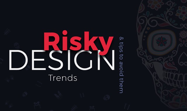
Why Some Design Trends Are Risky and How To Use Them Correctly
Everybody wants their website to be modern and trendy. But when building your site you should remember that in some cases less is more and follow that principle. If you fill your page with tons of trendy features, you might end up with a complete mess instead of a beautiful website you always wanted. Be reasonable and never implement more than you actually need.
What trends are we talking about? Why and how can they hurt your UX? How much of them can you use safely? This article contains answers to all those questions, provided by creative web design and marketing experts from TemplateMonster, a huge marketplace with tons of different digital products for everything and everybody.
TemplateMonster.com is famous for its huge collection of high-quality ready-made templates. That’s where customers can find a ready-made solution for any purpose and simply the best WordPress themes. It’s worth noticing that the company has recently turned into a digital marketplace that welcomes vendors to represent their products.
Getting back to risky web design trends, never use trendy elements just because they are cool. They may look good, but they don’t always improve the UX. When used improperly, they can have a very negative impact on your website’s overall usability. There are lots of trends and new ones keep appearing every day, but they are only healthy for your resource when used with caution.
When trends are overused, that’s when they become dangerous. When implementing them, follow the three golden rules:
- never overuse them
- make sure that whatever you want to implement is relevant
- ask yourself: “Will this element actually help my website?”
In the infographic below you will find the most dangerous design trends, their pros and cons and how to avoid their negative impacts. You will learn how to create a trendy website without ruining its UX.

Glaring Colors
Different color palettes set different moods for your page and it’s very important to choose a scheme that fits your content. Bright colors create energetic vibes and pastel ones feel more relaxing. If you decide that a bright palette fits your website, you should be wise about the colors you choose and how you implement them.
Risks:
- a page that’s designed in all vibrant can be painful to look at
- text becomes hard to read on a bright background
Tips:
- compensate the brightness with darker or neutral colors
- use colors to draw your users’ attention to certain elements
- don’t use them as your main background
- don’t place them close to the text
Tiny Details
Geometric shapes and patterns look cool and can make your content more visually interesting. They have to serve a purpose, though. Use them to point out or balance the text.
Risks:
- might interfere with the main text or even navigation
Tips:
- place on a monochrome background
- work best in minimal layouts
- make sure they don’t wreck your page’s readability
Animation
Almost every website features animations today. They look cool and definitely make your webpage more visually impressive. But they can be a little obnoxious and increase your site’s loading times.
Risks:
- increase your loading times
- can be distractive and even confusing
Tips:
- use them subtly
- optimize them so they don’t look choppy and mechanical
- don’t mix heaps of effects
- don’t use too many of them, otherwise, your loading times will be tremendous
Parallax
Parallax is awesome. It makes your website look cool and very engaging. But overdo it, and your site is doomed. Be smart and use a reasonable amount of floating elements.
Risks:
- can be disorienting and even cause motion sickness
- more mobile than web-oriented
- isn’t SEO- friendly
- increases your loading time
Tips:
- be smart about how many floating elements you use
- practice subtlety to point out other design elements
- don’t use it word-heavy and eCommerce sites
Alternative Layouts
Alternative layout designs are awesome and innovative when executed correctly. If you don’t design your page wisely, though, it can turn into a navigational hell and you certainly don’t want that. Balance your layout to create a thought-through visual hierarchy that is a pleasure to browse instead of a confusing mess.
Risks:
- can make it difficult to find specific content
- can disintegrate your website’s usability
Tips:
- use well-structured blocks
- keep grouped elements in close proximity
- separate text blocks
- avoid using on content-oriented pages
Petite Typography
Stands out from the rest of your text and looks quite stylish. Works best when surrounded by negative space. Should be used in short paragraphs in order not to overload your readers.
Risks:
- affects readability
- can blend in with the rest of the page
Tips:
- place it in negative space
- make it stand out with contrasting colors
- use at least 13pt typography
Unusual Navigation
Perfect for websites that don’t have much content to show off. It makes interaction creative but may be difficult to pull off. When designing experimental navigation patterns, make sure they are user-friendly and thought-through.
Risks:
- can be misleading
Tips:
- must be user-friendly and intuitive
- should be accessible through every page or menu
- works best for smaller websites
Stock Photos
To be honest, nobody likes stock imagery. It looks unprofessional and does nothing to make your site stand out from the others. We highly recommend that you get original photos or make your own ones instead of using stock. It’s bad for you.
Risks:
- they have a terrible reputation
- look unprofessional and even unreal
Tips:
- if you really want to use stock imagery, choose the best of it
- edit it to make it look at least a little original
- avoid them
Infinite Scrolling
Infinite scrolling is perfect for galleries, shops and blogs. It may, however, mess up your site’s usability if used incorrectly. Users can feel lost when they have no indication of where they are on the website and given no other navigation options.
Risks:
- can become very disorienting
- increases your page loading time
Tips:
- guide your visitors with call-to-actions and tooltips
- a sticky footer or menu is perfect in tandem with infinite scrolling
- works best for galleries, shops and social media sites
- don’t make infinite pages
Pop-ups
Everybody hates them. They are very aggressive and have become the most disliked design trend as of late. They may show good conversion, but will always annoy your users. It is also very hard to design a pop-up that will actually be able to give your visitors a lot of information.
Risks:
- are very aggressive
- disliked by users
- users may even leave your webpage because of pop-ups
Tips:
- try to design them as non- intrusive as possible
- don’t use entry pop-ups (those are the worst!)
- don’t ask for contact information
- pay attention to their timing and position
Hamburger
Hamburger menu was originally designed for mobile interfaces and should be used for desktop carefully. The hidden menu can be hard to find for users who aren’t familiar with the icons. If people have to spend time just to find the menu, you should probably revise your design.
Risks:
- can be hard to find
- having too many options in the menu could be confusing
Tips:
- choose an icon that screams “Click me, I’m a menu!”
- make sure your site is compatible with multiple browsers for correct display of the menu
Video Background
Background videos look cool and can make your website more engaging, but it also makes the content on top of it hard to read. It also slows down your load times and makes your page heavier. Pay attention to how long your video is and if it affects the readability of the content on top of it.
Risks:
- makes content on top of it harder to digest
- can be distractive
- makes site heavier and increases loading times
Tips:
- place a pause button
- use short clips with no audio
- compress your video so it doesn’t affect the loading times too much
- make content on top of the video stand out from the background
Before You Go
So, we’ve told you about a bunch of risky design trends. You have probably seen a lot of them in action on the websites you visit, but that doesn’t mean that they’re absolutely unusable. We’ve told you how to use them wisely and negate the negative impact they might have on your page. How you wish to design your template is completely up to you, we’re just trying to help you out. But remember that creating a trendy and fashionable website doesn’t always mean creating a good one. Keep a good balance to maintain smooth browsing experience and good looks.


Leave a Reply
Want to join the discussion?Feel free to contribute!